Conversational Lead Funnel
Rocket Mortgage, 2021
Background.
Every Rocket Mortgage client starts in the same place, filling out a digital lead form then talking with a mortgage banker. The lead form, however, ends at a frustrating dead end while the client unexpectedly receives a phone call. The hypothesis is this experience was the primary driver for low top-of-funnel success rates. The challenge was to measurably improve the lead form experience without negatively impacting lead flow.
My Role
I was the sole designer on a team of 3 engineers, a product manager, and a quality assurance tester. We partnered with data, banking, and marketing teams.
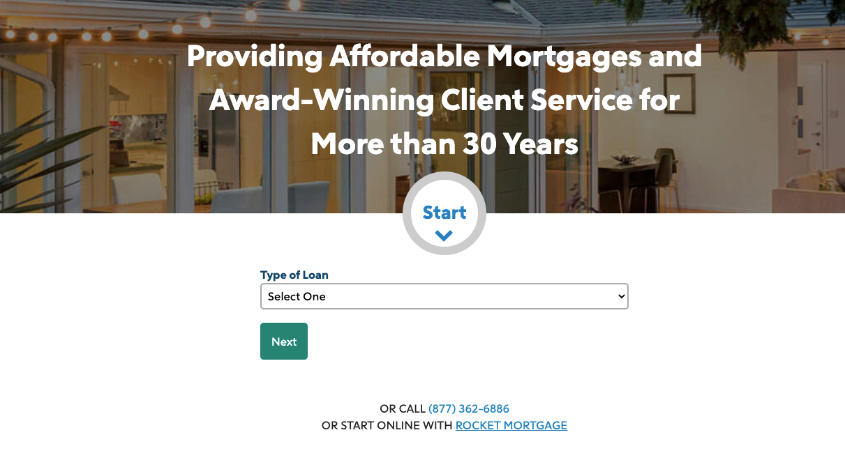
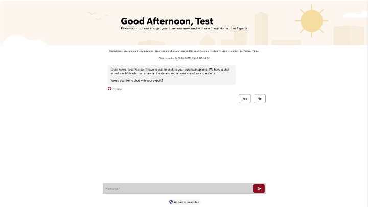
Existing lead form
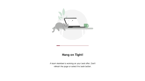
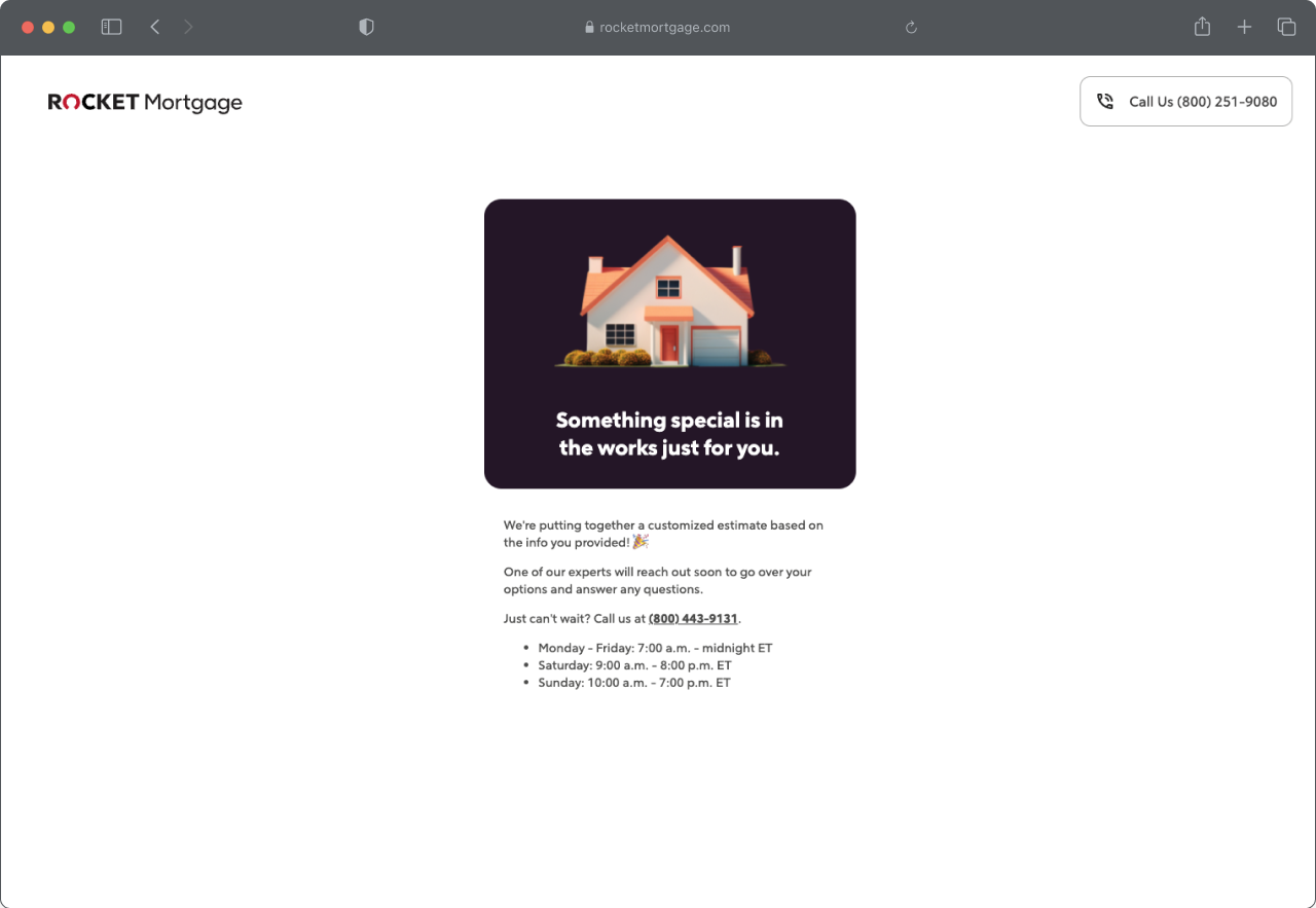
Dead end at the end of the form
Initial Research.
I started internally by meeting folks in the performance marketing team to learn more about how they designed their lead forms as well a bankers to understand how well the current experience worked for them.
I uncovered the following initial insights:
Less than 2% of people who complete the form answer their phone when we initially call. Mortgage bankers follow up an average of 4 times with less than a 20% success rate at contacting the lead.
The current experience had a 28% completion rate with the majority of the drop off happening in the first 30% of the form.
Initial Design.
I held co-creation sessions with internal team members such as customer service representatives and home loan agents. These individuals spend most of their working day talking to users and have a finger on the pulse on what resonates them.
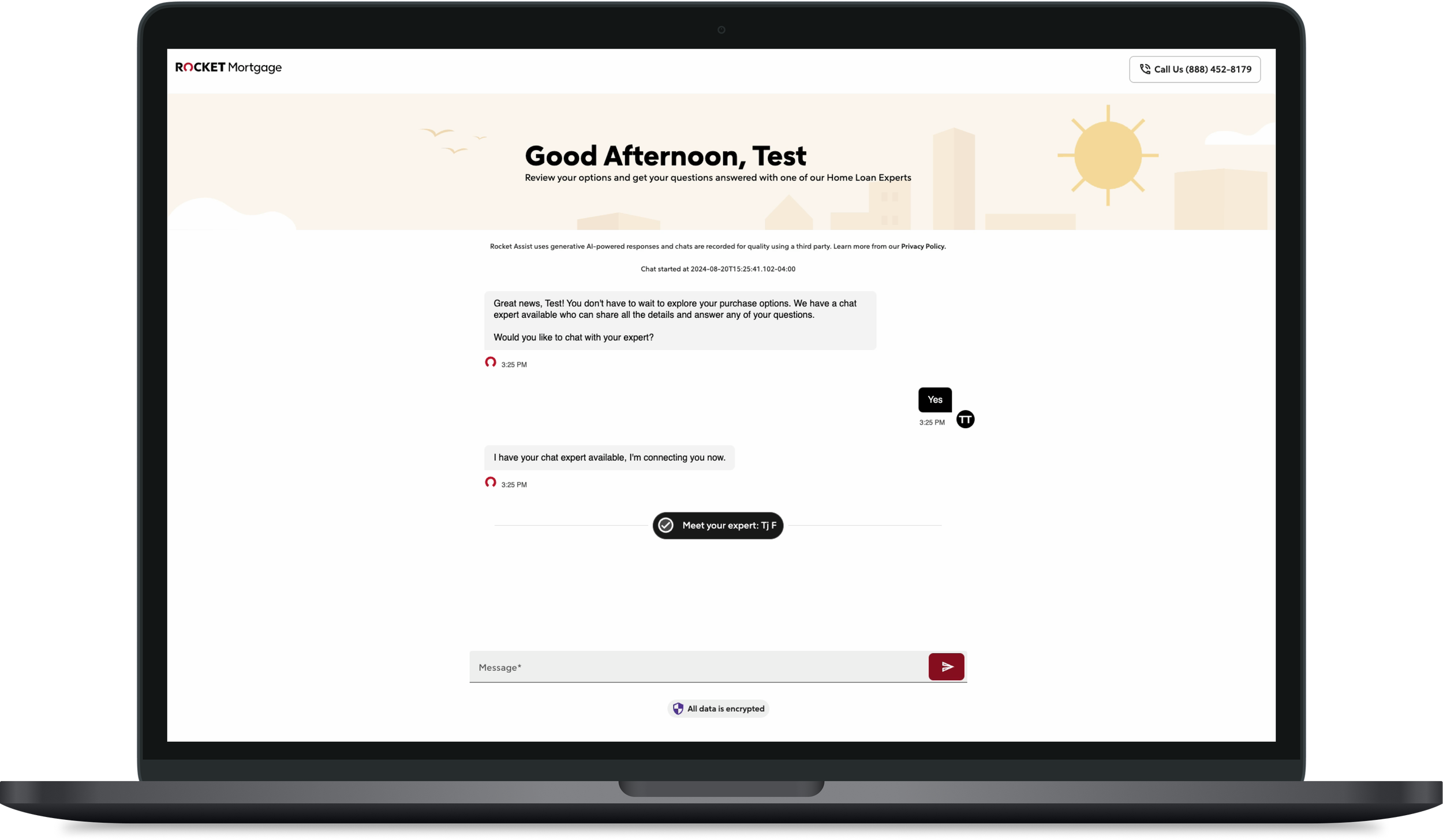
I created a full-screen/full-browser conversational UI that enabled clients to chat with our conversational AI and mortgage bankers. The experience integrated with Salesforce for mortgage banker chats so that our users had one seamless experience. We also added light personalization by leveraging client info gathered from the lead form including their name, property type, and local time of day.


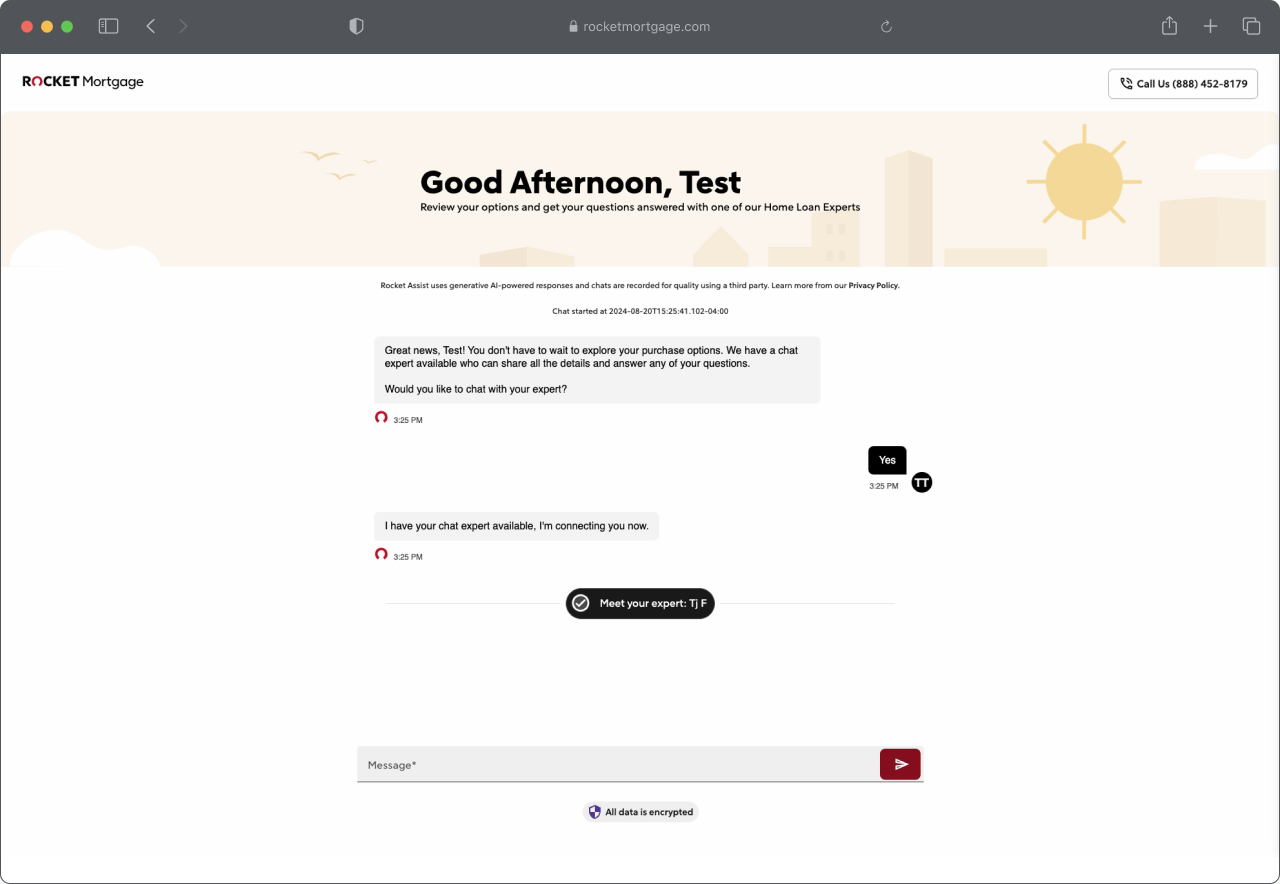
The new conversational UI
Transitioning from the lead form to the chat UI
Chatting directly with a mortgage banker in the new UI
Results
Our conversational UI landing page won the A/B test with a 69.58% lift which strongly indicates clients at the end of the lead form preferred chatting versus getting a phone call. Our completion rate (lead submittal) is 47% (up from 28%) which is amazing in the lead generation world.
After analyzing quantitative and qualitative data I found the following additional insights:
45% of users indicated that they were looked to buy a home in 2 - 6+ months.
Our highest drop off rates were when we asked users for their phone number and the new zip code (where they were planning to purchase)
I changed the question to ask for City/ State instead of Zip code and made certain questions conditional based on how users answered previous questions. For example, if a user told us they were at least 2 months out from buying a house, we would skip asking them intimidating questions such as the amount they’ve saved for their down payment and what the exact purchase price of their house is.
My favorite part however is that the success of this project convinced stakeholders such as my director to invest in UX. At the start of this project, I was the sole user experience professional on my team and had no budget to conduct research or test hypotheses. Now, I’m one of 5 UX designers and my team has an allocated UX budget.
Reflection
This project anchored my belief in using quantitative data to identify problem areas, qualitative data to diagnose the problems, and design to ultimately fix those problems. I learned a ton about stakeholder management, UX buy-in, and even got to flex my baking skills by making these dope cookies for our product launch.
