How might we create ways to easily translate raw data to emotional, invigorating, thoughtful design?
University of Michigan, Graduate Capstone
We started with an idea: to empower people to artfully tell stories while increasing knowledge of a data-driven world. A few years ago, The National Center for Education Statistics (NCES) assessed the data-interpretation and problem-solving skills of adults in 23 countries, and found that the United States ranked 21st out of 23 countries participating. Data is a scary concept for a lot of people and our project aims to lower the barrier of entry to create and interpret data visualizations.
The Vision.
We believe that great data visualizations are both art and science. The science part is the numbers, the data, the hard facts. The art part is the abstract, the presentation of the facts so that people understand the message. We believe that the future of data visualization lies on this spectrum.
So we decided to design a tool that would appeal to artists and make them want to root their art in data. But we also want our tool to appeal to data scientists and make them want to use art to make their visualizations more intuitive.
Make it stand out
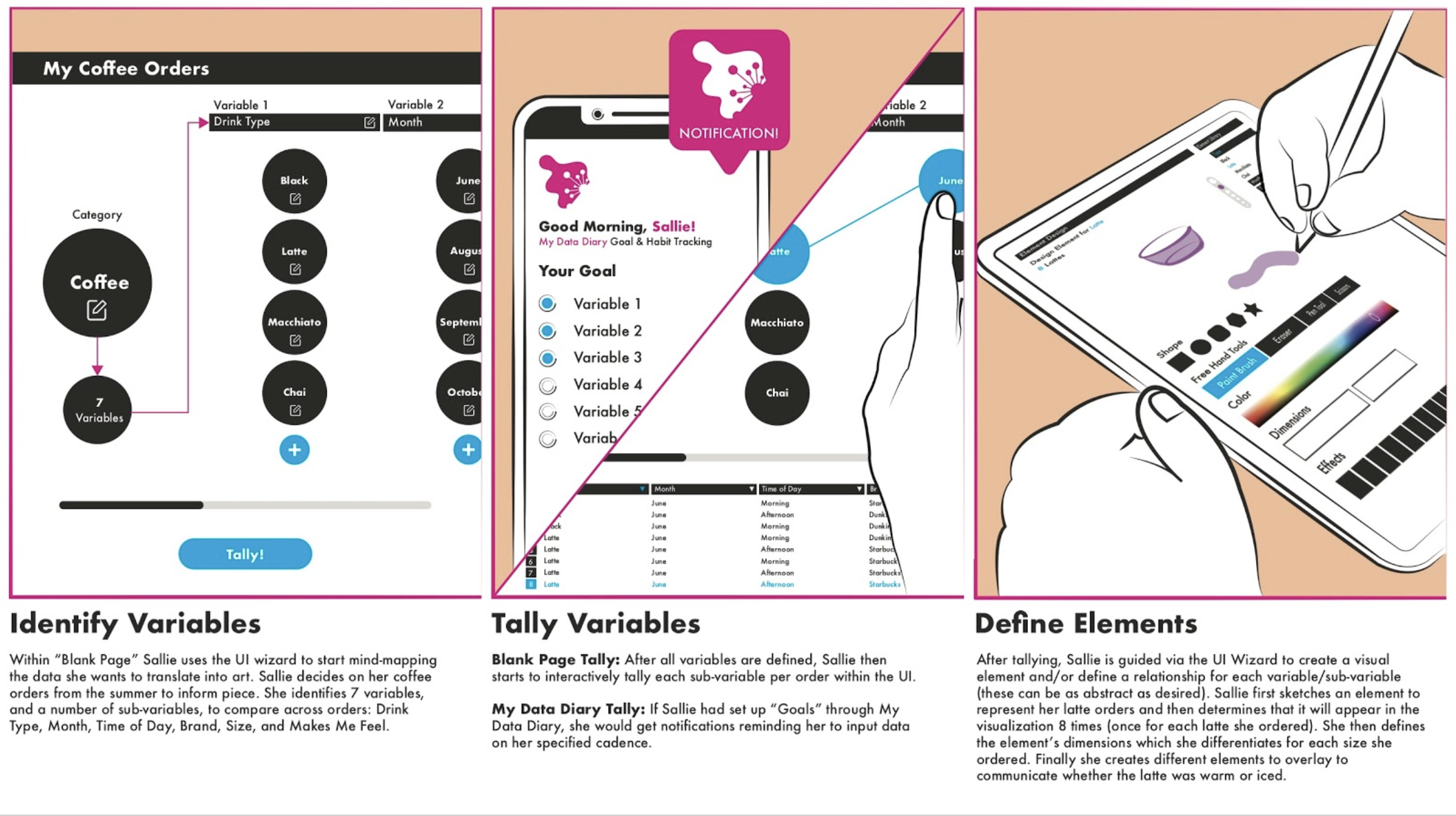
Snippet of the created storyboard. This storyboard was tested with potential users to ensure the ideas were understood and the user flows made sense.

A snippet of the information architecture. Artful’s UI is comprised of 6 discrete flows:
No User Signed-In
Sign-In
Create Account/On-boarding
Define Data Set
Create Art
Settings
HCI International 2021 the 23rd International Conference on Human-Computer Interaction loved our project so much they decided to publish it!